Projects
Providing your companion with progressive and seamless care for years to come.
Mer Bleue Veterinary Hospital
 tienne and Diane reached out to us about creating the website for their new veterinary hospital! Us being the animal-lovers that we are, we jumped at the chance of bringing their online vision to life. 🐾
While the hospital wraps up its construction, we've built a quick landing page to help their clients find them more easily. Full site is coming soon!
View siteClient
Mer Bleue Veterinary Hospital
Services
Web Design
Web Development
Helping busy healthcare practices work more efficiently.
Auxita
 e partnered with jane doe studio to bring their client Auxita's website to life. They provided beautiful page designs and content, while we took care of everything under the hood!
Client
Auxita
Services
Web Development
Every business plans, but business never runs as planned.
Kinaxis
 inaxis brought us on board as consultants to audit their website and come up with a fresh design and more intuitive user flow. We also created a web style guide to manage their brand's cohesiveness across all pages.
Client
Kinaxis
Services
Consulting
Web Design
Quality Assurance
UI/UX

Every batch made with love and intention.
Soul Sips Tea
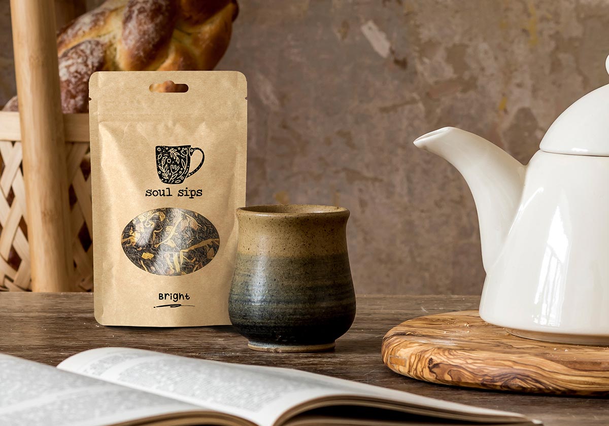
 elanie, owner of the Soul Sips tea company, approached us with a wonderful dream of hers. Over the years she's nurtured her passion for tea making, sharing some of her favourite memories with her nan over a warm cup, and was now ready to turn her hobby into a business.
She wanted something hand-drawn, using an achromatic colour palette, that conveyed a friendly and warm tone. Since we were only working with black and white, the sense of warmth and motion were shown through the floral-whimsical elements inside the mug.
Client
Soul Sips Tea
Services
Print Design
Visual Identity


Ontario’s leading research network for older adults with long-term care needs.
QUILT Network
 he Bruyère Research Institute brings to life many projects each year related to Ontario and Canadian healthcare. One of those projects developed was The Ontario QUILT (Quality for Individuals who require Long-Term support) Network, which had a great deal of research and material available, but required its own online space to communicate and share information effectively. We designed and built their website with older adults in mind, using larger text sizes and limiting mixed page content.
Client
Bruyère Research Institute
Services
Web Design
Web Development
Helping patients, families, and health care providers make informed health decisions.
Individualized Health
 nder the Bruyère umbrella, this Centre produces individualized tools to inform health decisions and planning for specific health concerns. We were responsible for styling the various tools found on the site, along with the design and build of the website itself.
Client
Bruyère Research Institute
Services
Visual Identity
Web Design
Web Development
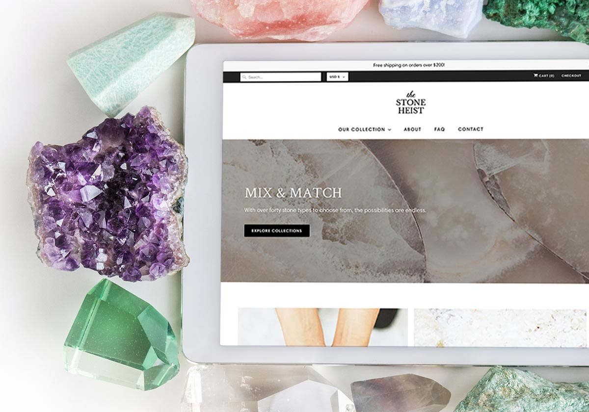
With over 40 stone types to choose from, the possibilities are endless.
The Stone Heist
 nia has a passion for artisanal mining and ethically-sourced goods and materials. She opened her first jewellery shop in 2011, sourcing gemstones directly through miners she's met around the world, and has now opened up a second shop selling semi-precious stones. Each stone has a unique colour, cut, and polish, and so we kept the site's design clean and direct, letting the products have the loudest voice on every page.
Client
The Stone Heist
Services
Visual Identity
Web Design
Web Development
Premium pacifyer and teething products for your little ones.
Crystal Cradle
 fter putting so much love and care into their new business, the Crystal Cradle team wanted some help developing their brand. Colours and shapes were chosen based on their existing products. We kept the concept flexible so that if they wanted to expand their product line they could, without sacrificing the brand's look and feel.
Elements from the logo were used to create a colourful, geometric pattern, which was applied to their custom mailer packaging. A business card, a cute handwritten thank-you note, and (if you're lucky) a few CC stickers are included with every order!
Unused concepts include square product tags and a custom vinyl decal design.
Client
Crystal Cradle Co.
Services
Brand Development
Packaging Design
Visual Identity


Portraits for business, government, and the arts.
Andrew Balfour Photography
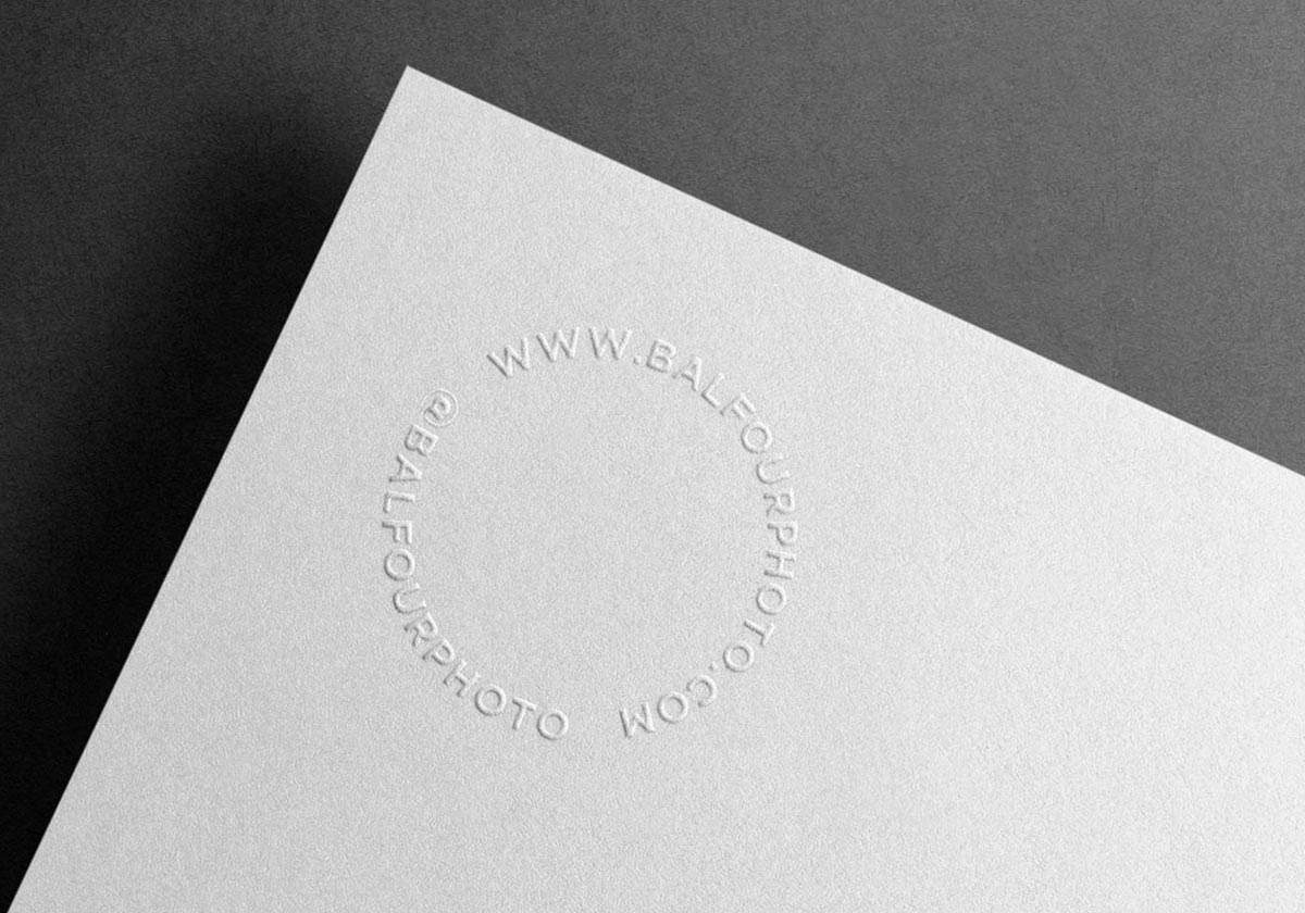
 ndrew came to us in need of a brand refresh for his photography business, known for portraits in business, government, and the arts. We created a classic and timeless identity by looking closely at Andrew's relationship with geometric shapes and movement, and piecing together a new logo and collection of brand material.
Client
Andrew Balfour Photography
Services
Brand Development
Print Design
Visual Identity


Family owned and operated for over 32 years.
Simply Natural
 fter years of continued research on the impact that chemicals have on our planet and bodies, Simply Natural has developed a passion for using as many pure, natural, organic, and eco-friendly resources as possible. They use minimal packaging, reusable glass jars, and try to cut down on waste whenever possible.
Although they already have their products on shelves across Ontario and Québec, Simply Natural wanted to take the next step towards boosting their online presence. We designed and built their online shop, using beautiful new product photos that were shot in-house.
Client
Simply Natural
Services
Photography
Web Design
Web Development


Forever vegan,
gluten-free and nut-free.
Strawberry Blonde
 e love Strawberry Blonde's products and were very excited when they asked us to help redesign and build some signage for one of their shops here in Ottawa. After matching exterior paint colours with their brand guide, we got to work crafting a robust A-frame that could stand the test of time (or at least our snowy winter months).
We were also tasked with various print material, and bringing a cohesiveness to their brand by consolidating the number of colours and fonts being used.
Client
Strawberry Blonde Bakery
Services
Brand Development
Print Design
Woodwork

on a project together?


